
Quick Links
- Header Mode
- Itinerary Name Location
- Trip Summary Mode
- Trip Information Mode
- Display Overview Images
- Documents
- Price & Terms
- Destination Mode
- Accommodation Mode
- Accommodation Info Mode
- Daily Information Mode
- Map Mode
- Transport Page Mode
- Information Mode
- About Us Mode
- Images
- Need help?
Availability
Classic Template Settings are available on the Digital Enterprise package only.
Navigate to Themes

Scroll down to Classic and click create new
The best way to explore these options is to use the Theme Customiser's Preview Window, make a change, preview the result, and adjust until you're happy with the look.

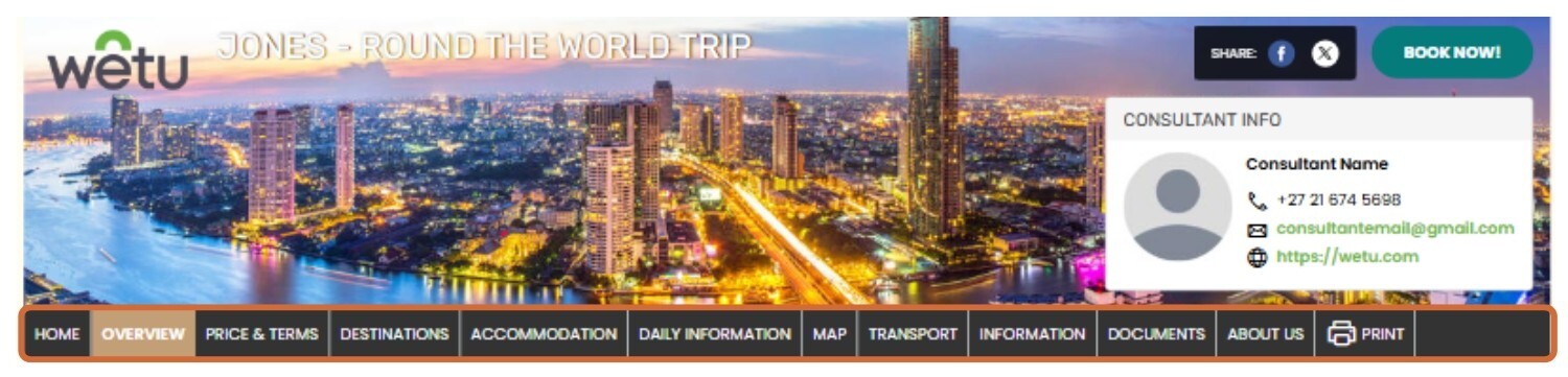
Header Mode
Controls the navigation bar style and position at the top of the itinerary.
| Tabbed |
 |
| Navigation above - Narrow Width |
 |
| Navigation above - Full Width |
 |
| Navigation above - Full Width with Spacing |
 |
| Navigation below - Narrow Width |
 |
| Navigation below - Full Width |
 |
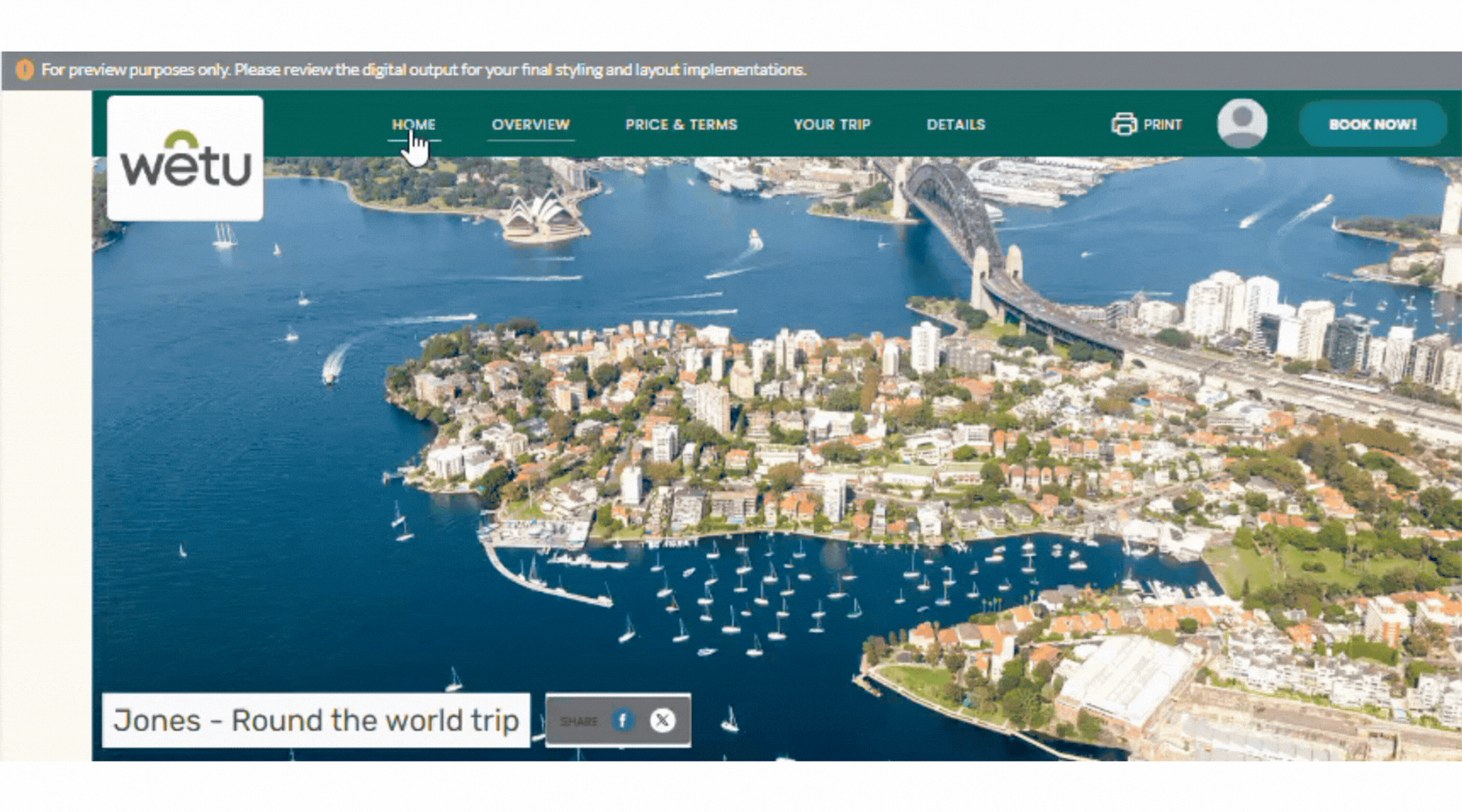
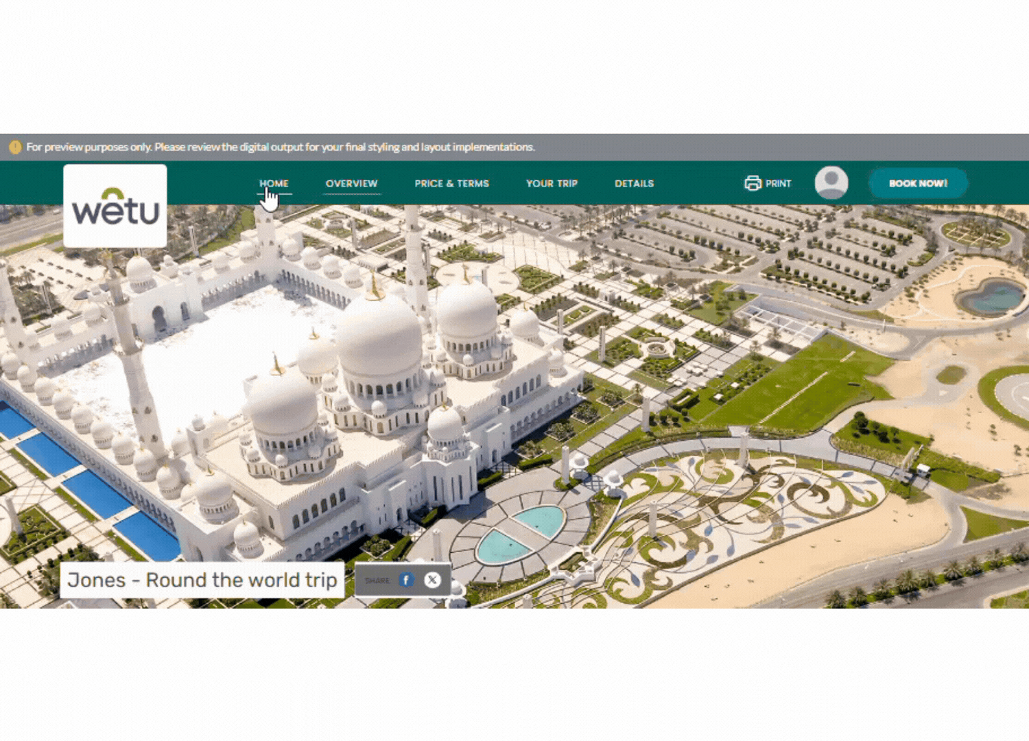
Itinerary Name Location
Controls where the itinerary name appears in the output. The exact placement depends on the Header Mode selected.
| Option | Description |
|---|---|
| Title Bar | Removes the itinerary name from the banner image and places it above or below the banner, depending on the Header Mode. |
| Banner Image | Places the itinerary name inside the banner image. Position depends on the Header Mode setting. |
| Navigation Bar | Displays the itinerary name in the navigation bar. |
| Tabbed - Title Bar |
 |
| Navigation above - Title Bar |
 |
| Navigation below - Title Bar |
 |
| Tabbed - Banner Image |
 |
| Navigation above - Banner Image |
 |
| Navigation below - Banner Image |
 |
Contact Information Location
| Navigation Bar |
 |
| Banner Image (Navigation above) |
 |
| Tabbed |
|
|

Trip Summary Mode
Controls the layout of the trip summary on the Overview page.
| Block |
 |
| Gallery |
 |
| Grid |
 |
| Card |
 |
| Timeline with Map |

|
| Timeline with Background Image |
 |
| Masonry Timeline |
 |
Tips: For Grid Trip Summary, also set Trip Information Mode to Grid for the best result. Card mode works well for itineraries with mobile accommodations - it lists stops in a concise, readable format.
Note: The background image in Timeline with Background Image cannot be predefined - it is selected at random from destination images in the itinerary and changes each time the itinerary is opened.
Trip Information Mode
Controls the layout of the trip information block on the Overview page.
| Side Bar |
 |
| Block |
 |
| Grid |
 |
| Vertical Tabs |
 |
Display Overview Images
When enabled, destination and accommodation images appear on the Overview page. Untick this option to remove these images from the overview.

Documents
Controls where documents attached in Step 6: Additional Details appear in the itinerary.
| Option | Description |
|---|---|
| Standalone Page | Default. Documents appear as a separate screen in the digital itinerary. |
| Same as Trip Information | Documents appear alongside the Trip Information section on the Overview tab. |
| Standalone Page |
 |
| Same as Trip Information |
 |
Price & Terms
| Option | Description |
|---|---|
| Same as Trip Information | Pricing and terms display alongside the Trip Information section. Display varies based on the Trip Information Mode selected. |
| Standalone Page | Pricing and terms appear as a separate section in the itinerary. |
| Same as Trip Information |
 |
| Standalone Page |
 |
Destination Mode
| Block |
 |
| Grid |
 |
| Timeline |
 |
| Five Image Gallery |
 |
| Six Image Gallery |
 |
| Gallery Carousel |
 |
| Gallery Slider |
 |
Accommodation Mode
| Block |
 |
| Gallery - Carousel |
 |
| Gallery - Embedded Thumbnails |
 |
Accommodation Info Mode
| Sidebar |
 |
| Tab |
 |
Daily Information Mode
| Block |
 |
| Timeline |
 |
| Centre Timeline - Small |
 |
| Centre Timeline - Large |
 |
Map Mode
| Option | Description |
|---|---|
| Separate Page | The map appears as its own tab in the itinerary navigation. |
| Overview Page | The map appears on the Overview page instead. No Map tab will appear in the navigation. If Trip Summary Mode is also set to Timeline with Map, the map will not be duplicated on the Overview page. |
| Separate Page |
 |
| Overview Page |
 |
Transport Page Mode
| Table |
 |
| Vouchers with Images |
 |
| Vouchers without Images |
 |
Information Mode
| One Column |
 |
| Two Column |
 |
About Us Mode
Functions the same as Information Mode - selecting "Two Column" splits the About Us section into two columns.
Images
| Image | Description |
|---|---|
| Landing Page Cover Image | Click + Upload to set the first image clients see. If a slideshow is enabled, this image appears first in the sequence. Use a high-quality image - Wetu will crop larger images automatically. |
| Banner Image | Click + Upload to set the header image in the itinerary. Defaults to Wetu content library images if none is uploaded. |
| Printable Itinerary Cover Image | Click + Upload to set a cover image on the first page of the Printable Itinerary only. |
| Landing Page Cover Image |
 |
| Banner Image |
 |
| Printable Itinerary Cover Image |
 |
Note: Wetu displays recommended image sizes next to each upload option. If you upload a larger image, it will be automatically cropped to fit.
Need Help?
- Contact Support: support@wetu.com
- Live Chat: Available on your Dashboard